NDP studio
Agency rebrand
NDP studio is a digital agency based in central London. The agency has worked with well known clients such as Imperial College or Diabetes UK, it is known for their UX and technical support services and is aiming for their creative services to become equally as important. With this in mind, this rebrand and website redesign were created.
All visual communication aspects were done or managed by me. I worked as Lead Designer for this project. The process included understanding the problem with the current brand, imagining how the redesign could solve those problems and really bring the brand forward without losing its personality.
In terms of the website UI / UX work, later stages included the creation of:
- Wireframes (based on the content's structural needs, provided by the information architect and directing board)
- Branding elements, UI and overall designs (keeping in mind the new brand's visual communication, output included brand strategy, dev ready assets and directions)
- Animations (AI, AE, with outputs of Lottie and Gif)
- Quality assurance process
- And to finalise we worked on the iteration of next steps to roll out the brand (incl user research and feasibility tests)
Please scroll down and click the images below for better understanding of the project.
In this project I will focus on explaining the Visual & Branding side.


To show a bit more of the visual process, please see the images below. More of the process can be explained on request. Including how the discovery mode took place, and how the double diamond module applied to this project.
Challenges (some of them)
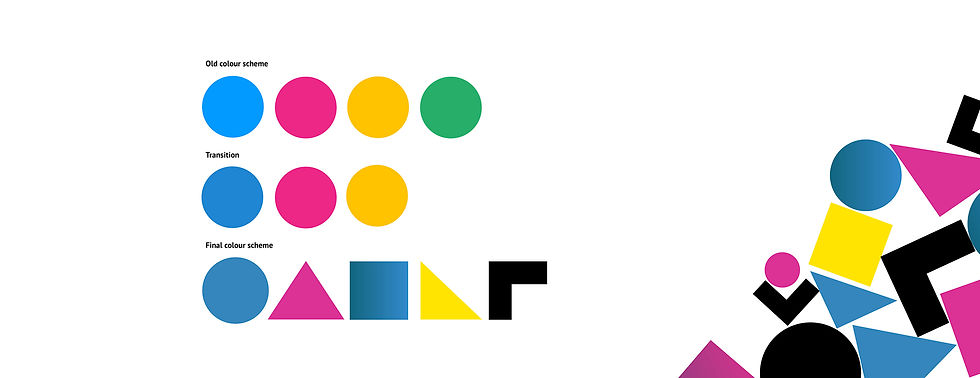
In terms of colours, the main issue proved to be the bright pink and pink, there was also a generalised dislike of the green and confusion about when to use it. The solution was to reduce it to 3 main colours, with 2 types of darker blues and pinks. The yellow was brightened up to help with the overall balance. A more dynamic use of shapes was added (as explained previously).
In terms of fonts, we needed to make everything consistent as there were 4 different being used across various platforms. So for titles we went for a new bolder look, in this case I opted for a strong geometric sans-serif typeface, that could have modern impactful titles. For body text I used one of my personal favourites, PT Sans, very easy to read and working well with Montserrat creating visually dynamic pages.
Outcome
This rebrand was very well acclaimed by existing clients and stake-holders (based on interviews and direct feedback). Unfortunately I left the company for a new challenge, not long after roll-out, so I don't have access to success metrics for a longer period of time.