100%
Users increase
Yearly active users grew from 950K to 1.9M.
Year 2022 vs 2024
~20%
Product growth YoY
Overall product growth YoY 2022-2024, (fluctuation of 15-23%)
x2
Conversions
Conversions more than doubled, from 4.3M to 9.2M. YoY 2023 to 2024.
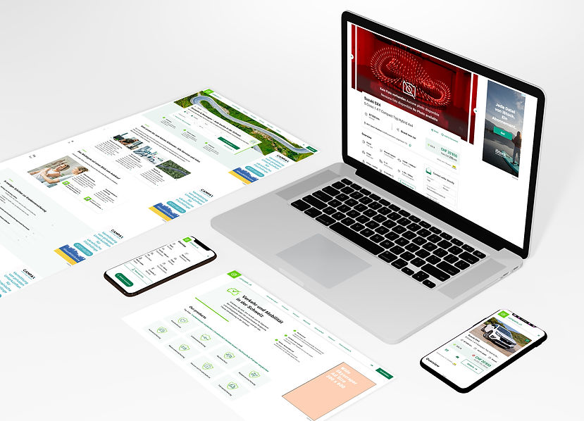
Car selling platform
Marketplace
Comparis is the biggest comparison and fintech platform in Switzerland, offering more than 15 different services that range from health and car insurance comparisons to mortgages, loans, telecom packages, and real estate listings. It also runs popular marketplaces for cars and property, all within the highly regulated Swiss market. This environment becomes complex quite quickly and requires careful navigation of compliance, user needs, and business goals.
The car marketplace is one of the most used platforms for buying and selling cars in the country. It aggregates listings from multiple sources to give users a complete view of the market in one place. I am showing this project as a focused example of my hands-on work and its measurable results over three years. While I also led the design for the home selling and renting platform, here I wanted to highlight the growth of the car marketplace. Between 2022 and early 2025, collaboration with the product manager and development team led to a doubling of key metrics such as active users and conversions, while maintaining a consistent and user-focused experience.
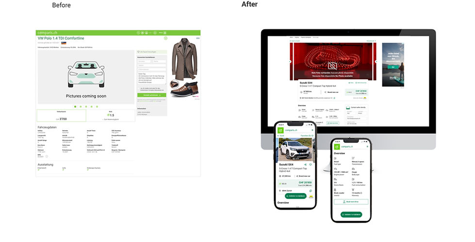
The images above shows the design of the detail page for each car, the 'before' is from when I joined the company (early 2021) and the 'after' is the work done around 2024.
Main problems to solve
- Old brand, a lot of resistance to new and modern layouts.
- Speed of execution, the old technology behind these pages created big tech debt issues
- As conversion and revenue were especially low to start with, prioritisation of this product was considerably low
- Specific to this page, main issues included:
> low conversion rates
> Lack of consistency and hard to compare (user testing suggestions)
> Not enough traffic to other product areas (cross-selling)
Implementation strategy
- Embrace slow and steady pace, with regular but small updates
- Always testing, AB tests, maze and other testing forms, whatever it is, always checking if it is the right direction
- Fail fast, learn, improve. The classic 'don't fall in love with your ideas'.
Key UX/UI initiatives
- Addition of more CTA points (sticky button, book a test-drive, etc)
- Addition of a share functionality and better favourites management (connected to a whole new mycomparis section we also created in parallel)
- Better cross-selling elements for car insurance or loan calculators
- AI pre-filled text messages and basic information for quicker and more unique contact forms for each user.
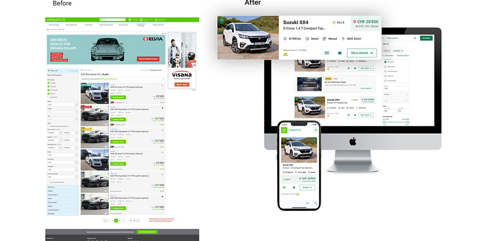
The images above show the design of the results' page (or basic listing page) for each car, the 'before' is from when I joined the company (early 2021) and the 'after' is the work done around 2024-25.
Page specific problems to solve
- Filter interaction was difficult and long, users struggled to find what they were looking for
- Users also found it hard to compare the products without an image carousel on this page, forcing them to open the detail page far too often
- Cross-selling was not effective
- Accessibility issues in main CTAs (colour contrast issue)
Key UX/UI initiatives
- Direct comparison, to solve the user's difficulty in analysing two or three specific cars. Comparison table created
- More interactive and re-ordered filters. Based on usage, the filters were re-ordered and selectable 'chips' for quick understanding of what is selected and quick 'de-select' options
- Other UI changes: Re-positioning and re-colouring (due to accessibility, contrast) of CTA button and click through gallery in this page
- Price raise/drop indicator, with comparison tool for cars with same specifications
- Search alerts' optimisation, connected to myComparis
- Better cross-selling elements for financing options (ie Leasing and loans options)